My post from last Friday, in which I suggested that Poland's currency, the złoty,
should have its own symbol rather as the pound, the dollar, the euro or the yen have, has attracted a number of ideas from readers and Twitter followers (and family members). The best contributions are displayed below:
Left: Tomasz Majewski (@tomaszmajewski) from Minneapolis suggests a pair of wavy lines intersecting the diagonal of the 'Z'. So far, Tomasz is the only person to skillfully use vectors to provide a decently curve on the wavy lines.
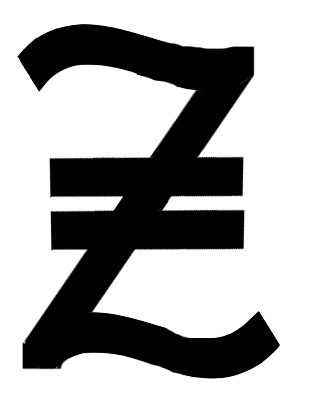
Left: in answer that an overly geometric design smacks of fascism, the novelist B.E. Andre (@B_E_Andre) has suggested wavy top and bottom horizontal lines of the letter 'Z'. Then two parallel bars can intersect the diagonal line of the 'Z', being shorter than the wavy lines. Alludes to a hand-written upper-case Z.
Left: here's my father's idea - use the diagonal of the 'Z' and use it as the line turning the 'l' into an 'ł'. The relative sizes of the 'Z' and the 'ł' indicate the first and second letter of the word 'Złoty'. Key thing is the right proportion between them.
Left: Ross Humphrey's idea is to take the regular alphabetic designator 'zł', and merge the two letters into one symbol using a wavy line linking the 'z' and 'ł'. Typeface - Calibri. This didn't work on my version of Photoshop - this font came out small (despite a 72pt setting).
Left: tongue-in-cheek concept from my brother Marek; a 'Z' and an 'ł' within an 'O'. Spelling '
zło', a reference to
Radix malorum est cupiditas - "love of money is the root of all evil" (Timothy 1 6:10).
The design somehow suggests to me motifs from the Coen Brothers' film,
The Hudsucker Proxy.
Any more suggestions?
This time last year:
The future of Warsaw's public transport
This time two years ago:
This time four years ago:
(on the superiority of Polish schools to British ones)
This time six years ago:
This time seven years ago:
This time eight years ago:


2 comments:
Ok - I've been ruminating on the subject since your original post (there's an A4 sheet covered in hand drawn/written zeds, pounds etc, by my keyboard) and my conclusions are that anyone attempting to design one for the polish zloty needs to get a piece of paper and write the existing ones in script, in their normal handwriting followed by numerals. $100-00 say. Then in fast handwriting.
Then write some zeds with straight lines through them, then with wavy lines. How easy were they to write compared to existing symbols?
Further,notice the similarities between the pound (like a zed but with a shorter top horizontal (especially if your script capital zeds loop at the top and bottom), the Rupee (resembles a skewed zed two lines at the top), and the Turkish lira (like a zed formed by writing and L and drawing two lines through it) and note what a pain it is to write scribbly lines in the normal flow of writing. Also note the Zeds resemble crossed out 2s whether one or two horizontal or a vertical strike lines are used).
Convention seems to favour the parallel or single lines that appear to suggest continuity or perhaps steadiness.
My last attempts have me trying to decide between something like this https://script.byu.edu/Pages/German/letters/f.png (minus the curl on that angled short line) which can be seen as a p with two lines through it which form an up angled zed (though the line/s cutting the vertical stroke could be horizontal), or a simple zed with a double line through it (as per B.E. Andre above).
I wonder what others think of the writeability of the various proposals?
No, it should be the _Mark_ of Zorro, that way it will be easier to change into Eyros at a later date.
Simply write down the number and then a lightning fast swish of the pen, Z over the top.
Post a Comment